Chinese typefaces: Kai, Song, Ming, Hei
While thinking about the best way to visually present dictionary entries in a desktop dictionary app, I had to dig into Chinese typography. This is the first of two posts where I share what I’ve learned in the process. I hope you’ll find some of this information useful.
The biggest decision was what kind of a typeface to use for showing Chinese characters, and I needed reference points in order to make a good choice. If your background is similar to mine, you’re probably more familiar with “Western” typography, so let’s start from there, and then move on to the Chinese script.
Latin/Greek/Cyrillic typography
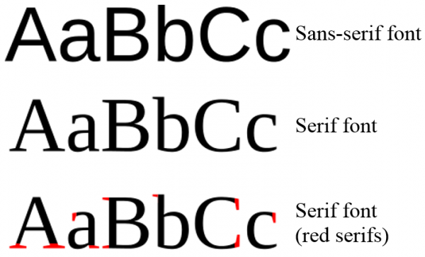
In “Western” typography, or more precisely, in typesetting text in the Latin, Greek or Cyrillic (LGC) alphabets, there are two major kinds of typefaces: serif and sans-serif. The difference is in the small lines attached to the end of strokes, as illustrated by this image:
Serif typefaces are alternatively called “Roman,” and Times New Roman is probably the most widely used one of them:

Sans-serif is alternatively called “Grotesque” or “Gothic,” and my favorite is Tahoma, although Arial is probably more widespread:

The difference between serif and sans-serif is more than aesthetics. There is pretty solid evidence that it’s less demanding on the brain to read lots of printed text in a serif typeface; conversely, until very recently, the simpler shapes of sans-serif letters were better suited for computer displays. As even average screens approach retina resolution, this is distinction is quickly becoming obsolete.
Other factors come into play, however: depending on the typeface you’re seeing, you trust the exact same text slightly more or less. Errol Morris demonstrated this convincingly in 2012 through an experiment on the readers of The New York Times. It’s a fascinating story, make sure you follow up on the link. And if you’re doing PR for a multibillion-dollar research facility, make sure you don’t announce the discovery of the God Particle in a Comic font.
But enough of the philosophical dimension of typography; let’s look at a few more down-to-earth aspects of LGC typefaces. Unless you’re using a typewriter (monospace) typeface, each letter has a distinct width – an “i” is narrower than an “m”. When the computer draws words on screen or on paper, the typeface is not only telling it what shapes to use for each letter; there are also intricate instructions for spacing letters that end up neighbors of each other in your text. This process is called kerning, and even if you’re not conscious of it, it makes all the difference between text that looks jugged and uneven, versus text that looks balanced and pleasant.
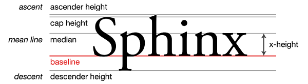
Beyond the use or omission of serifs, the feel of an LGC typeface is mostly determined by its vertical proportions.
Chinese typefaces
So if we have serif and sans-serif typefaces in LGC typography, what’s the lay of the land for typesetting Chinese text?
Before I can even begin to look at typefaces, there are a number of key differences that lie in the nature of the script itself:
- As far as Chinese characters are concerned, variable width makes no sense. Each character occupies a rectangle of the same dimensions.
- The same concept of baseline, x-height, and parts of characters extending below and above lines defined by these, also does not exist.
- There is no fine-tuned kerning: each single-character block is spaced at a fix offset from the neighboring ones, regardless of the specific characters that participate in the rendez-vous.
There are apparently three major types of typefaces in modern Chinese typography. It’s possible to loosely associate them with LGC styles, and while this may be a useful thing to do if you’re coming from a “Western” background, I am quite wary of such parallelisms – we are, after all, talking about a tradition that developed independently, and the similarities are at best superficial.
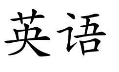
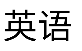
The first is regular script, or 楷书•楷書 [kǎishū], also referred to as 楷体•楷體 [kǎitǐ]. This script is derived directly from a form of handwriting; so much so that in all Chinese textbooks I’ve come across so far, the printed guides for teaching beginning students how to write characters are printed in this style. You could loosely associate Kaiti with cursive (handwriting) LGC typefaces. Below is a sample for 英语 [Yīngyǔ], meaning “the English language,” in simplified characters:
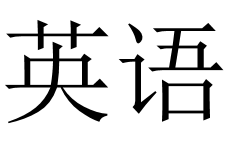
The next typeface, more distant from handwriting, is alternatively referred to as Song or Ming, or in Chinese 宋体•宋體 [sòngtǐ] or 明体•明體 [míngtǐ]. I am frankly confused by the naming, and I don’t find Wikipedia’s explanation terribly enlightening either: The names Song (or Sung) and Ming correspond to the Song Dynasty when a distinctive printed style of regular script was developed, and the Ming Dynasty, during which that style developed into the Ming typeface style. Be that as it may, this typeface could be said to loosely correspond to LGC serif, due to the triangular embellishments at the end of strokes. Horizontal strokes tend to be strictly horizontal, uniform width, and narrow; vertical strokes are thicker. The same two simplified characters we’ve seen before, now in a Song typeface:
Finally, the most abstract or “minimalistic” style is 黑体•黑體 [hēitǐ], referred to as “East Asian gothic” by way of association to sans-serif typefaces. It is characterized by no embellishments at the end of strokes and a strong predilection for uniform-width, strictly horizontal or vertical lines for most stroke types.
Windows fonts
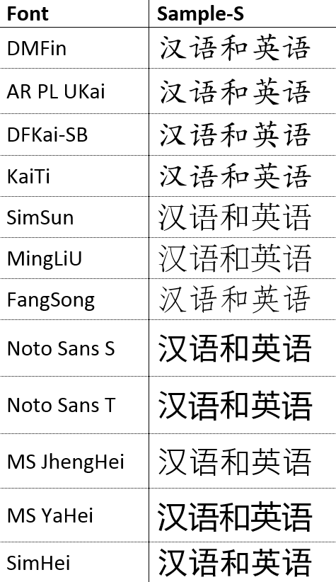
I created a table including the Chinese fonts installed on all Windows systems, plus some free fonts. I’m just including a screenshot without more explanation here; I’ll come back to an extended version of this table in later posts. The first couple of fonts are Kaiti, followed by Song/Ming, and finally, Heiti.
Useful links
The pages below are great starting points to get free Chinese fonts, and to get an overview of the fonts pre-installed on Windows systems:
https://www.google.com/get/noto/#/
http://www.clearchinese.com/resources/fonts.htm
http://www.pinyinjoe.com/windows-7/win7-chinese-fonts.htm
Wikipedia pages about the Chinese typefaces mentioned in this post:
http://en.wikipedia.org/wiki/East_Asian_gothic_typeface
http://en.wikipedia.org/wiki/Ming_%28typefaces%29
http://en.wikipedia.org/wiki/Imitation_Song
http://en.wikipedia.org/wiki/Regular_script
Finally, in PDF form, two theses that both deal with the more intricate/technical details of creating actual Chinese fonts for use in computers. Even if you don’t particularly care for the geeky details, both papers contain a fascinating introduction about Chinese typography and fonts in general; I personally got a huge kick out of reading them:
Philip Jägenstedt (2008): Vector Graphics Stylized Stroke Fonts
http://blog.foolip.org/2008/06/12/vector-graphics-stylized-stroke-fonts
http://www.diva-portal.org/smash/get/diva2:18417/FULLTEXT01.pdf
Elena Jakubiak Hutchinson (2009): An Improved Representation for Stroke-Based Typefaces and a Method for their Creation
http://www.eecs.tufts.edu/~jakubiak/downloads/Thesis.pdf