Zero, one, many, tons
Most of what we do in life is about doing stuff with a bunch of stuff at hand. Programming and UI design are no exceptions. It is all too easy to overlook the impact the number of things in “stuff” has on the outcome. This post is about edge cases.
Traps
The most trivial mistake you can make is to forget about edge cases altogether. I improvised a piece of truly messed up code to show this. The function below receives an array of integers, and it’s supposed to return an index showing where the value in the first slot occurs later on in the array, or -1 if it doesn’t occur again.
1 2 3 4 5 6 7 8 9 | int IndexOfFirstInRest(int[] array){ int first = array[0]; for (int i = 1; i != array.Length; ++i) { if (array[i] == first) return i; } return -1;} |
As long as you only ever pass arrays that have at least two elements this code works fine, but it breaks in two obvious cases:
- An array with only a single element: the for cycle will never terminate. Depending on your language, you may get a runtime error the first time the code attempts to index into the array beyond its length, or it may just produce “undefined behavior,” fetching values from memory it has no business reading, and repeating as many times as there are integers in the language.
- An array with zero elements: even worse than before, the code is invalid from the very first statement, producing either a runtime error or undefined behavior.
You could say this is such a blatantly flawed piece of code no developer would ever commit it to a real code base. In reality, failure to account for trivial edge cases like this make up a huge share of bugs I have fixed over my carreer – and also a huge share of the bugs I created myself.
It’s fair to say this function is never meant to receive arrays that are shorter than 2 elements (not to mention null pointers/references instead of an actual array, a case I didn’t even bring up). That’s the function’s contract. Some languages provide explicit ways to declare such contracts; others give you the means to manually check for edge cases and barf if the function is called in ways it is not meant to be. Then there is the school that says whoever calls the function should know what they are doing and have the discipline to honor the contract; in exchange, they receive a faster function without built-in sanity checks.
When I structure my own code, a lot of the effort goes into making sure it’s not even possible to use my artifacts in ways that don’t make sense. Most likely you don’t want to do this kind of duplicate searching on any old array – probably the array itself is part of a larger entity that can never contain less than two integers here. That’s the entity’s invariant, and if you represent it as a class, you can make sure there’s no way to end up with an instance that has fewer than two values. Inside that class, the function above would be perfectly legit.
Yet in reality code evolves; you, or a different developer, may change their mind about that class’s invariant years into the future, and forget about the poor function that relied on it. In ways that are sometimes subtle, sometimes hideous, edge cases return to bite us, even if we spend a lot of our time thinking about them.
Note: You could say I was using the wrong example here – what I showed was an ignored constraint; edge cases are about extreme values that are legal within the constraints. Does the routine above work well with the minimum “legal” number of items? Does it work OK with one more? What if legal includes zero, one and many? You are right; I lead you astray. But read on.
Now let me take a closer look at some contrasts, and how they affect not only programming (doing stuff with stuff) but also UI design (showing stuff).
One/many
How is dealing with a single piece of something different from dealing with many? Here’s one dictionary entry from Zydeo:

Does the same layout work when you have at least two entries to list?
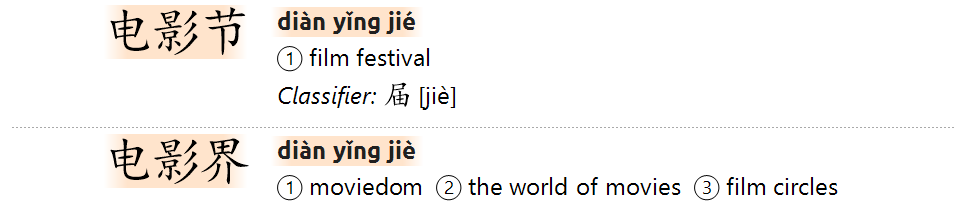
It turns out it works (because I already put a lot of effort into making sure it does), but there are new things to keep in mind. The typography of the headword’s Hanzi and Pinyin go a long way towards visually structuring what you see and making sure you can identify what’s a single entry and where each new entry starts. But I felt more was needed to separate items, hence the dotted line.
That dotted line is the odd thing: you don’t want to show it if there’s only a single entry on screen, and you don’t want it at the very end of a list either; that would just build a pointless visual cage into your canvas. “One” in this respect is different from “many,” and the “last” is different from all the rest.
Lists, if you come to think of it, are all over the place. What movies are playing tonight? What books by Pynchon can I buy online? What charges did I put on my card last month? We have come a long way (mostly) from lists like these:
Compare that with this generally familiar list:
Many/tons (design)
This is the divide where it starts to get exciting. OK, you came up with the mother of all lists, and it works great if you have a handful or a few dozen items. Does it work well when you have thousands? Tens of thousands? The reason I find this particularly exciting because this is where design and programming become inseparable.
But first, a purely design aspect. If you have so much of something that it doesn’t fit on a screen, you must make choices. Add a scrollbar? Add paging? Cut the list after X items? Only load X items first, then expand the list if the user scrolls to the bottom, and/or explicitly clicks to request more?
Let’s say you opted purely for scrolling. That immediately creates an additional zero/one contrast: do you want to always show the scrollbar, even when it’s not needed? Or make it appear only when the content no longer fits on the screen? Having gotten that out of the way: is your scrollbar still usable when the list is really, really long?
Here’s a scrollbar (horizontal just to make it fit better with the text here):
![]()
The darker grey rectangle is the “thumb,” the part that you can drag to move your “window” over the really big canvas you’re looking at. The thumb’s size gives you an idea of the size of that canvas: if the canvas is big and your screen is small, then the “window” is relatively small, so the thumb is smaller too:
![]()
But what happens when the canvas becomes really, really huge? So huge that the thumb, if you want to be proportional, is reduced to a single pixel? This is a really nasty thing to do to your users:
![]()
Anticipating these edge cases and handling them elegantly is what sets fine interfaces apart from mediocre ones.
Many/tons (programming)
Suppose you figured out the behavior of your scrollbar when really large canvases are at play. But is your tool really able to copy with, say, displaying 25 thousand entries when someone puts “to,” the most frequent English word in CEDICT, in the search field and hits Enter? Or does that blow up the tool?
Granted, that is not a realistic use case; I cannot think of a real-life situation where I would want to browse 25 thousand dictionary entries for whatever purpose. But this fits into a broader set of design decisions.
If you think showing 25k entries is not realistic, but still it can easily happen given the specific data you work with, does that mean you should actively limit the number of results? If yes, then where exactly – at 100 entries? Or 531? You can arbitrarily cut the list, or choose to show only entries that contain the search text and nothing else, or complicate the search with a system of asterisks to define where you want partial matching, or add paging, or…
I thought through these dilemmas for Zydeo and consciously decided that in order to keep searching simple, I’ll avoid all the tedious wildcards, paging and the like. This means you are free to put in “to” and Zydeo should not explode on Enter. While this is not how I expect Zydeo to be used, making it fast enough to deal with 25k entries has the benefit that it will be really, eye-blinkingly fast in the typical scenarios.
This was a relatively easy decision to make because all the factors are under my control. If Zydeo were a browser-based online dictionary, downloading thousands of entries may take too long, and browsers may have a problem displaying such amounts of formatted text, no matter how much I optimize my own code. That would be a different scenario with different constraints, and I would probably make different decisions right down to the way how lookup works. For what it’s worth, desktop tools still have a tremendous performance edge over browser-based, online software.
At the end of the day, these decisions are the consequences of your priorities and the technological constraints you must work with. Designing any piece of software is a process of negotiating these factors and your users’ priorities to find that sweet spot where the cost of creating the tool is in balance with the value it adds to users’ lives. Making it your second nature to identify edge cases and argue about them improves your chances of finding that sweet spot.
Zero/any
Remember the silly function from the start of the post? Passing a zero-length array (or even null) is a classic zero/any contrast in programming. Developers are, generally speaking, used to these. What seems to have a much shorter tradition is thinking about zero information in UI design.
Zero information comes in two frequent forms. The first is when no one has asked a question yet, so there is nothing to say. The second is when a question has been asked, but there is no answer to show.
No question yet. It might seem the only thing a poor computer program can do if you haven’t asked it a question yet is show a blank screen, right? It turns out we can do much better than that. For many kinds of apps or tools, if you know the current time, the person’s location, and the questions he or she has asked in the past, you can already make a very informed guess at what the next question might be, and anticipate it by showing that information. If someone opens a public transport timetable app on a weekday morning, and she typically checks commutes to the same destination (her job) at that time of day, then you might just start by showing the options to get to her work from her location right now.
If that kind of thinking doesn’t make sense for your tool, you can still use the opening screen’s whitespace to show Getting started tips for new users. A word processor might make it easier to start writing if it shows a title box and the place for the first sentence, perhaps with a grey cue.
Zydeo, for now, opens with an empty starting screen. What I think may make sense in a dictionary is a short Getting started page for new users, but I can see how that would become irritating if you used the tool every day. Sure, when there is something new (like an update), the empty screen at startup is the best place to show a notification. But for the rest, I haven’t made up my mind yet.
No answer. If there’s no dictionary entry for the word the user just put in, is showing an empty screen really your best shot? For now, that’s actually what happens in Zydeo, apart from a text saying “No results” in the area where Zydeo normally shows the number of results after a successful query.
Showing absolutely nothing if a query yields no results is a really bad idea. It is disconcerting; how am I to tell if I just asked the wrong question, or if the software is malfunctioning? And in either case: what am I supposed to do next?
This is definitely one area where Zydeo can (and will, soon) do much better. When there’s no entry for a Chinese query, Zydeo could at least break it down into its parts and show shorter words; effectively answering a different but similar question.