Your German vocabulary on a curve
My German vocab test, wortschatz.tk, has been online for over three years, harvesting a growing stream of results. A look at the 15.3k non-repeat submissions reveals the contrast between native speakers and language learners. The two cohorts’ scores can be well fitted to two different statistical distributions. Expect nice charts to show up on the test’s results page soon!
What’s my vocabulary?
It started with a conversation in early 2016 with a German teacher friend. I had previously stumbled upon an online vocabulary test for English, and the two of us were debating how many words one knows at various levels in a foreign language. She thought 10 thousand words were quite a lot; I thought that was rather little. My German is a strong C1 / low-ish C2 level, and I suddenly had an urge to find out what my own vocabulary was. Unfortunately, there was no German vocab test on the internet.
So I set out to build my own.
It can be measured, therefore it exists
If you want to find out how many words a person knows, you need to start out knowing what a “word” is. Unfortunately, there is no good (empirical) definition of a word. It’s best to avoid that problem altogether and say, for the practical purposes of my test, I’ll take an existing dictionary and consider whatever has an entry in it to be a word. Now a new problem arises: no two dictionaries have the same set of headwords. Typically, though, a comprehensive dictionary will contain between 30 and 100 thousand entries, so that’s the range we’re working with.
The main consequence is that the maximum score anyone can achieve in a test like this is the size of the underlying dictionary. That’s an arbitrary upper limit that has nothing to do with how many words any real person knows.
How do we know we’re measuring anything real, then? Well, a vocab test is real the way an IQ test is. Intelligence has no empirical definition either; it is what IQ tests measure. We consider the tests kosher because their results show some agreeable statistical properties. When a lot of people take them, their scores line up nicely on a statistical curve.
The same is true for vocab tests. The results fit nicely on a curve, and you can observe correlations that make sense: the longer people learn a language, the higher they score; for native speakers, the higher their education and age, the higher their score.
A vocab test doesn’t tell you how many words you objectively know. But relative to the score of all the people taking the same test, the score of each individual is meaningful.
Specifics of this test
The dictionary I used for this test is the word list of OpenThesaurus[1] as retrieved in the fall of 2016. That means just a bit over 55 thousand words.
The most straightforward approach is to pick a random sample of, say, 100 words from the dictionary and ask the test-taker to mark the words they know. If they know 80% of the sample, then we extrapolate that they know 80% of the dictionary. I.e., 80 words out of the sample of 100 translates into a vocab of 44 thousand words. Depending on the size of the dictionary and the sample, we can attach a confidence interval to the statistical estimate, saying, for instance: This test result means we’re 95% sure your vocab is between 44 thousand words plus/minus 4,312 words.
In my test I added two minor twists. First, I ordered the 55k words by frequency (based on the German Reference Corpus[2]), and split the ranked list into three sets of 9k, 18k, and 28k words, respectively. From each of these sets I randomly picked 40 words for the sample, which means that more frequent words are overrepresented. The purpose is to make the estimation more precise at lower vocab sizes, which is where I expected most of my audience to be as foreign language learners.
The other twist is that I manually filtered the sample somewhat, discarding items that were very obviously international words (think “Computer”), or transparently derived from much more frequent words (think “Busfahrer”). This is tricky business because it can insert a bias and ruin the required randomness, so I followed a method of always picking the next suitable item on the frequency-ranked list.
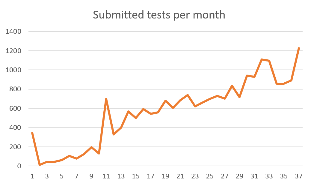
Results over 3 years
When I launched the site in October 2016, I posted about it in a handful of places and asked friends to share it via Facebook, but I haven’t otherwise promoted it since then. So I was very pleased to see that it’s taken on a life of its own, generating a steadily growing stream of submissions:
After you complete the actual vocabulary part of the test, the website shows a few optional questions before revealing the results:
- Are you a native speaker or a language learner?
- What’s your age?
- For native speakers, your country of origin, education, and number of other languages spoken
- For non-native speakers, whether you currently live in a German-speaking country; how much time you’ve spent in a German environment; and what your level is
The chart above ends with October 2019, and by that time, the test was taken a total of 21.1k times. 18.9k of these contained an answer to the native speaker question. The website records whether someone submits the test for the first time; of the 18.9k submissions above, 15.3k are first submissions. That is the dataset that the subsequent analysis is based on.
The overall distribution of scores looks like this:
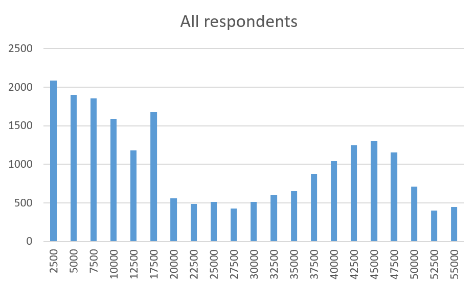
This chart is not very helpful. Clearly there are two trends at work here: a gradual decline on the left, probably representing language learners, and a second peak on the right, probably showing native speakers. If we’re particularly unlucky, the spike at the 17.5k range represents an anomaly or error in the test itself. Time to look at the separate charts for native speakers and non-native speakers.
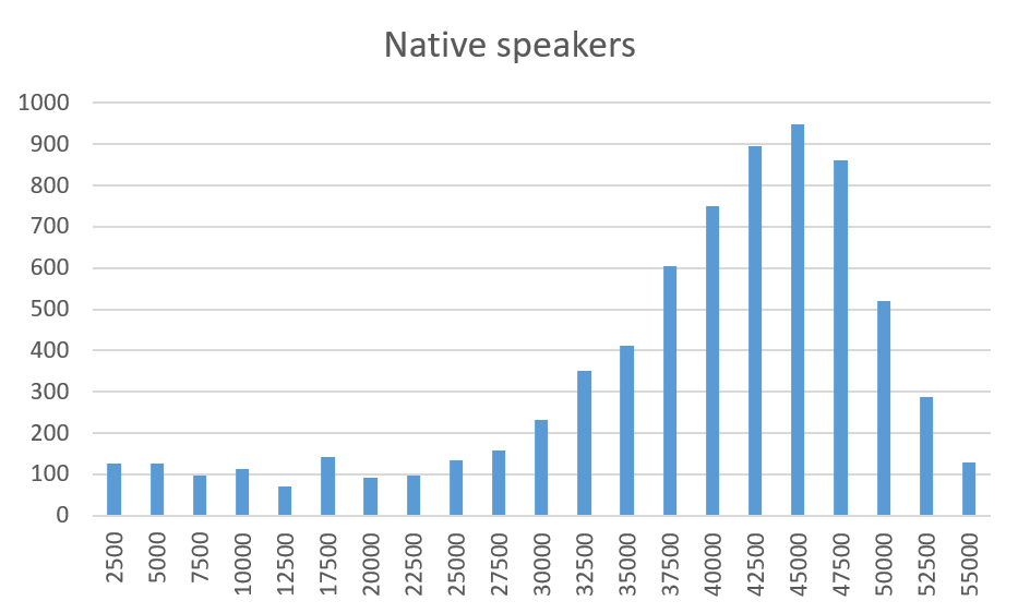
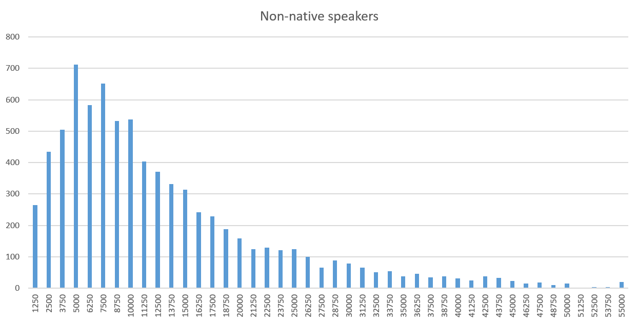
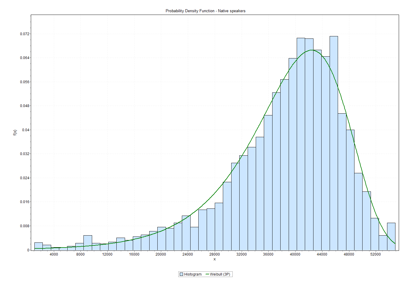
This is a lot more appealing. The separated datasets both appear to conform to some sort of well-behaved distribution. It appears the test is measuring something real after all. Yay!
(The hundreds of native speakers scoring under 25k is interesting, and I’m not quite sure what to make of it. Most likely a relatively small proportion of visitors submit the test without really clicking through it, just to see where it leads next.)
But what are the two distributions? I know just enough about statistics to understand that I know nothing about statistics. Correspondingly, I have zero routine to solve this kind of fairly trivial question. After some desperate Googling I ended up using the trial version of a tool called EasyFit[3], which told me the 3-parameter Weibull distribution is a really good fit for the scores of native speakers, and the 3-parameter lognormal distribution is a really good fit for non-native speakers. Here’s the full output for native speakers and for non-native speakers.
(BTW, what’s the deal with this type of super-specialized, but ultimately very straightforward and simple software costing $99 per seat for non-commercial usage? That’s one more unexpected mystery I came across over the course of this analysis.)

I haven’t yet taken a closer look at the effect of the other survey parameters on test results – e.g., how education and age correlates with vocabulary in native speakers. That remains to be done for a later blog post.
What’s next
The test seems to be puttering along pretty well on its own without any activity from me, so there’s no pressure to do anything, really. Considering that it was the very first browser-based tool that I built after programming things for the Windows desktop and for backends, I’m still pretty satisfied with the outcome over three years later. Pat, pat.
But now that I know the distributions, it makes a lot of sense to show these curves at the end of the test, marking the test-taker’s score with a vertical line. The same screen could show at what percentile that leaves the test-taker within the entire population. We humans like to compare ourselves to our peers, so I’m pretty sure this would add to the overall experience.
(Also, I’ve been looking for a place to use a library like Rough.js[4] or roughViz[5] for some nice, scrappy charts that look like they’ve been hand-drawn.)
If I do make a more significant change to the test itself, it would be to somehow reduce the sample size (120 clicks are quite tedious!) without sacrificing too much of the accuracy. A popular English vocab test first makes you click through a small number of words, and then takes you to a larger second part whose difficulty appears to depend on your previous answers. That makes intuitive sense, but I cannot wrap my head around the statistics at work here. I pinged the creators a while back to ask but got no reply; they also don’t seem to have published any scientific paper about their test.
Alternatively, maybe it’s possible to reduce the sample size by analyzing all submissions so far and measuring how each individual word in the test predicts the final score and keeping only a smaller number of predictors with well-known reliability. If you know your statistics and you’d like to help improve the test, do get in touch!
References
[1] /www.openthesaurus.de/about/download
[2] www1.ids-mannheim.de/kl/projekte/methoden/derewo.html
[3] www.mathwave.com/easyfit-distribution-fitting.html
[4] roughjs.com