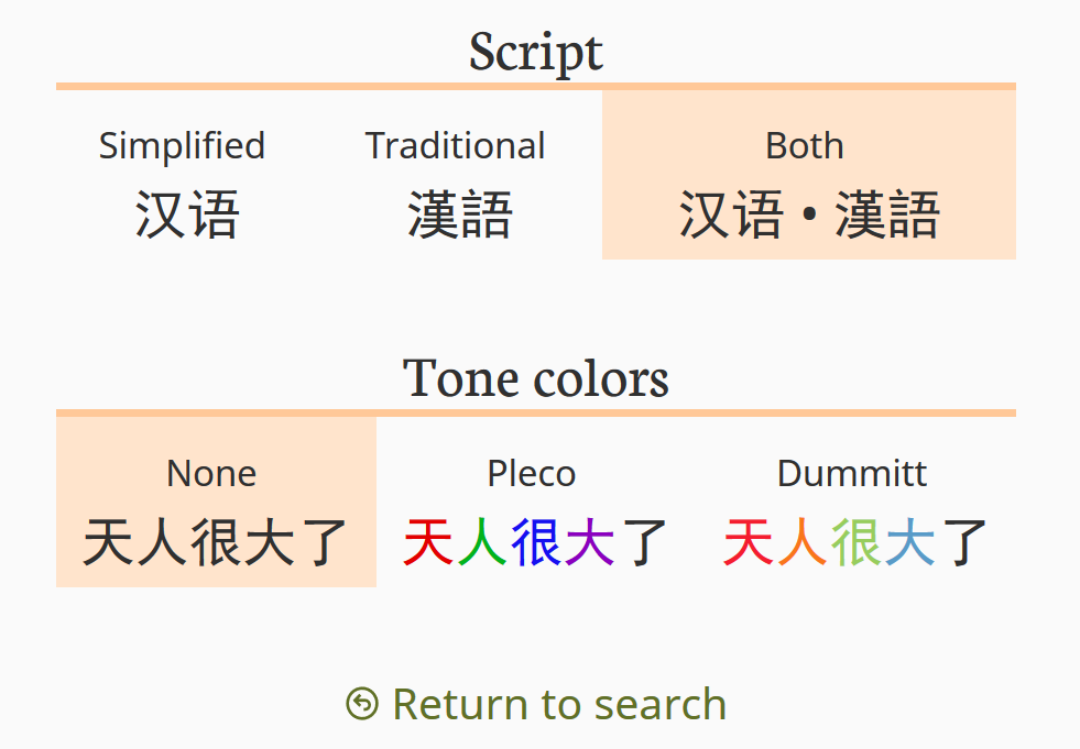
Color temperature of Mandarin tones
Call my lights dim, but I’d actually been using Pleco for years before the meaning of all those colors in each headword started to dawn on me. They stand for tones! From that baseline it was a long way until tone colors made it into HanDeDict@Zydeo, and I thought that’s a good excuse for a short post on here.
The idea
Exhibit A is a screenshot from Pleco: a random (and somewhat bizarre) entry that shows all four tones, and in a neat ascending order too:
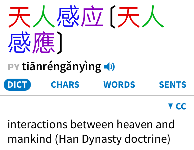
You get the point: the color of each Hanzi encodes that syllable’s tone. There’s no color on the Pinyin syllables, and why would there be – tone is already part of Pinyin through the diacritics over the vowels.
Color me skeptical. When I read and decipher Chinese text, I either don’t yet know a character, which means I have to look it up anyway, and the Pinyin then gives me the tone as part of the character’s pronunciation. Alternatively, I already know that character, and that means I know the tone too, right?
I started to be less sure when I noticed myself reading out text and repeatedly hesitating about the tone in words I’d just recently learned. It didn’t take long before my neatly printed text was decorated with tone marks over many a Hanzi. Oops… Now we’re talking, well, tone colors.
Information or distraction
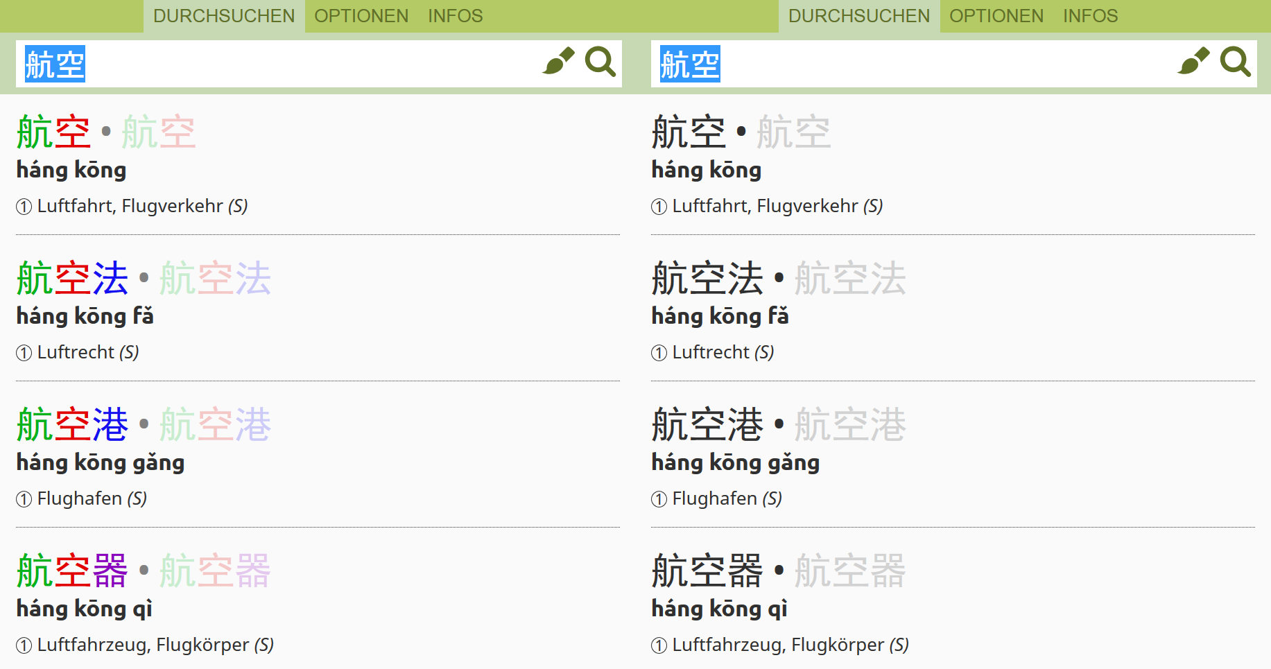
Exhibit B is a list of results from HanDeDict@Zydeo, with and without tone colors.
With the online dictionary as well as with the original desktop tool, I’ve spent the bulk of my time thinking about ways to eliminate clutter and complexity; ways I can reduce the interface to a single core purpose: the cleanest possible presentation of the information I’m looking for, and nothing else.
Are tone colors part of that? Do they actually provide value for me, or are they superfluous at best, or a distraction at worst?
There were two factors that made me decide to add tone colors, and have them on by default. The more important one is aesthetics. The way Zydeo presents results relies heavily on typography for structure: the size, typeface and weight of the text should create a rhythm that makes it clear what belongs together, and which part of the entry stands for what (headword, Pinyin, translations). After adding color into the mix, this visual structure just seems to work even better.
The second factor was: so many others cannot be wrong. If you check the most popular apps (I’m thinking Pleco and Hanping), they all use tone colors. So does MDBG, the home of CC-CEDICT.
Where it gets complicated
Yup, these dictionaries all use tone colors, but apparently they use different systems. That’s a very bad situation to be in: once you get used to one set of colors, it’s extremely confusing when you’re suddenly confronted with a different set. If you, like me, keep switching between keyboard layouts, you’ll know exactly what I mean.
The idea of using color for tones seems to originate from Nathan Dummitt’s Chinese through Tone and Color. The specific colors he chose are apparently the subject of some controversy, and the fact is that Pleco (to my mind the gold standard of Chinese dictionary apps) chose a scheme that’s quite different. Albert Wolfe took it all apart in Tone Colors and What Pleco Did with Them.
For the heck of it, let’s bring in Exhibit C: Dummitt’s and Pleco’s colors on the color wheel (screenshots from Adobe Kuler).
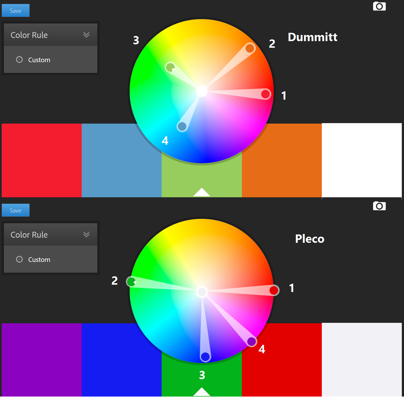
I find it fascinating that both schemes walk around the wheel counter-clockwise to get colors for tones 1 through 4. Both have the arguable weakness of relying on red vs. green, which is an accessibility issue for those with red/green color blindness.
I find Dummitt’s less saturated, softer colors more appealing. They are a good match for the soft, green-based color scheme of HanDeDict@Zydeo; a conscious choice whose purpose is to keep the interface itself discreetly in the background, ceding the floor to content.
Yet as I was test-driving the dictionary with both color schemes, Pleco’s saturated colors performed better, at least in my own subjective judgement. And even though Dummitt’s one and two are about as far from each other as Pleco’s three and four, the visual contrast seems to be a lot smaller. Ultimately, Pleco’s scheme won out as the default, but you can change that in Options.