Chinese typefaces: simplified and traditional
Anyone who’s dealing with Chinese knows all about simplified and traditional characters, right? I sure thought I did, but even as I was working on my desktop dictionary app, very self-assured of my knowledge, I discovered a whole bunch of subtle and unanticipated details. So I thought it’s worth dedicating a post to this topic, going back to first principles.
Hanzi, Kanji and Hanja
Characters originating from the historical Chinese writing system are currently used in a number of countries, as part of several different scripts. They are used to write Mandarin Chinese in the PRC (Mainland China), Taiwan, Hong Kong, and Singapore. A very similar, but not identical, set of characters is used to write Cantonese, particularly in Hong Kong and by overseas Chinese communities. (This is a true statement regardless of the very complicated and loaded question of whether Cantonese is a separate language or a dialect; a topic I definitely don’t want to pick up here.) The Mandarin Chinese term for these characters is 汉字•漢字 [hànzì]; from here on, I’ll refer to them as Hanzi.
Over the course of history, various East Asian cultures borrowed Chinese characters to write different languages. Thus, to this day, these characters, called Kanji, are a central part of the Japanese writing system. To an increasingly diminishing extent, they are also still used in South Korea, where they are referred to as Hanja.
As these things go, writing systems change over time. For many Hanzi, a straight line of “written etymology” can be reconstructed that traces their development from symbols on oracle bones all the way to modern forms that you see in print or on computer screens.
At different stages, there were centralized, conscious efforts of simplifying characters for practical purposes. This definitely happened to some extent in Japan, but I am not familiar with the circumstances of Japanese Kanji simplification. In the PRC, a huge effort of simplification was undertaken in the 1950s, with the explicit goal of spreading literacy by reducing the number of strokes needed to write commonly used characters.
Since the communities using the descendants of a writing system from an earlier era were acting independently, we ended up with more or less minor variations in how the same character is written – meaning, typically, different stroke order, or slightly shorter or longer strokes in particular places, a tilted stroke instead of a horizontal one etc.
The differences
As far as Japanese vs Chinese simplification goes, we have situations where the same traditional character was simplified in different ways:

|
Traditional Hanzi (retained in TW, HK) |

|
Simplified Hanzi (PRC, Singapore) |

|
Simplified Kanji (Japan) |
In the 1950s PRC simplification effort, the result was sometimes an altogether new character that was previously not in use; one such case is shown below:
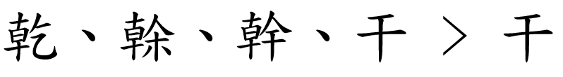
In other cases, one or more traditional characters were “conflated” onto a single pre-existing character. Such a case is shown below; incidentally, this particular conflation has given rise, in the age of machine translation, to countless profane and deeply amusing mistranslations.
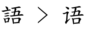
Simplification did not only affect full characters, but also frequently recurring components – particularly certain radicals. Compare the traditional and simplified characters below, which both contain the “speech” radical, in its traditional and simplified form, respectively.
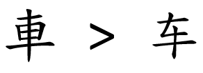
Finally, a big group of characters were not simplified either in the PRC or Japan, but through the gradual shift of conventions, they ended up being written slightly differently. Such a case is shown below, with the character in a traditional typeface on the left, and a simplified typeface on the right.
The similarities
Along came, from the 1990s onwards, the global standard Unicode, whose aim is to assign a “code point,” a commonly agreed and standardized number, to every written symbol occurring in every script used anywhere on the planet. Before we had Unicode, the standards organizations of different countries, or very often, plain old software companies, came up with arbitrary code points for whatever set of characters they needed to encode.
The experts working on standardizing Hanzi, Kanji and Hanja sifted through existing standards of different countries and a huge number of characters to decide what should be treated as a different character, and what should be considered as the same character, just written slightly differently due to convention. This process is called Han unification, and while it’s still occasionally contested and criticized, it was doubtless necessary for a very simple reason: there are a huge number of Hanzi/Kanji/Hanja around.
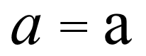
After all, no sane person would consider the two symbols below from the Latin alphabet as different characters; so why should we consider the two Hanzi right below them as different?
But because of the highly ambiguous way in which characters were simplified at different times and in different places, simplified and traditional variants of the same character had to be assigned to different code points – effectively making them different characters in Unicode.
The ambiguity
Remember the example where three traditional characters are “folded” into a single character, which, however, is a pre-existing character and itself already serves as a “traditional” symbol?
This ambiguity of the 1950s Han simplification means that there is no way to automatically convert a text written in simplified characters to traditional ones: you need to make sense of the text to decide if you need to substitute a specific character, and if yes, with which traditional one. Going from traditional to simplified is slightly less ambiguous, but in many cases even that is not obvious.
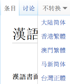
What I find particularly intriguing is the way Chinese Wikipedia works. It treats Chinese as a single language, and offers a drop-down menu at the top with automatic conversion options. Individual articles are apparently authored in a random mix of simplified and traditional, and even the script of the headwords is unpredictable.
I found no description of how this automatic conversion used by Wikipedia works, and I have no way to judge the results. If you have any pointers here, do let me know!
What this all has to do with typefaces
Let’s take a look at the expanded version of a table with Chinese fonts I already included in a previous post, now with simplified and traditional sample text side by side:
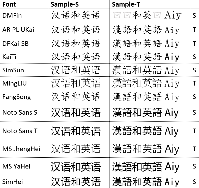
While I was still young and naïve, I assumed all I needed to show Chinese text, whether simplified or traditional, is a font that contains a graph for all the characters I needed – i.e., a glyph for all the simplified and traditional characters that occur in my text. Most of the fonts in this list have a very broad coverage (with the notable exception of the very first one, but more on that in a different post). So that’s all done and taken care of, right?
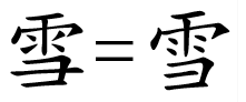
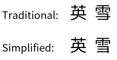
Wrong. Because Han unification in Unicode means that a character like 英 or 雪 only has a single code point, you need to choose a different font if you’re displaying it to an audience that’s used to simplified characters vs. traditional ones. Observe the subtle differences in both characters below, particularly the split grass radical at the top of traditional 英. The characters are presented here with Google’s Noto font, a Heiti (Gothic) typeface.
These differences may seem minor, but in the experience I gathered in my day job designing memoQ, an application with a central text editing component, they are mutually unacceptable to audiences accustomed to one or the other type of Chinese script. In Zydeo, I decided this was an essential detail: for a non-native learner or user of Chinese, showing characters that are “wrong” in some subtle way is either confusing or disorienting, and it should really not happen.
The last word on Song vs Ming
There is a great article by Richard Ishida, a member of the Word Wide Web Consortium, about simplified and traditional characters in Unicode. Its focus is different from this post’s, but a lot of what he’s writing about was directly applicable to my line of thought too.
In another post I was wondering about the confusing naming of Song or Ming typefaces, which are apparently the same thing in the guise of two distinct dynasties. A casual remark in Ishida’s article holds a piece of the puzzle:
“To see these correctly you need to apply the right font, e.g. a Song font for simplified and a Ming font for traditional.”
That jibes with what I found when reviewing the Chinese fonts available in Windows – you can see an S for the Song typefaces and a T for the Ming typefaces in my table.
Here’s the link to Ishida’s article: http://rishida.net/scripts/chinese/