A strange couple: HDZB_75 and Arphic Kai
In my search for the right regular script (Kai) display font for Chinese characters in Zydeo, I discovered two free fonts and became quite intimately familiar with both of them. Much of the story behind them is shrouded in mystery (and that’s not very likely to change), but even the little details tell a fascinating story.
HDZB_75 aka DMFin aka 汉鼎简中楷
This is the first free font I found, years ago already, on the ClearChinese.com site. (This seems to be the page, by the way, that all searches for Chinese fonts eventually take you to.) The story of this font, hiding behind the nondescript file name “HDZB_75.TTF,” clearly goes back to the early, heroic days at the dawn of the digital age (read: 2005 or thereabouts), when getting a Windows computer to display Chinese text somehow, anyhow, was a major challenge.
Read this thread, excited and desperate at the same time, from the Desktop Publishing Forum: Finally, Chinese fonts! But now I can’t use them… The original poster appears to have just discovered this same family of HDZB fonts, but had to struggle nearly two weeks before the font even showed up for him.
Long before I started working on Zydeo, I have been using this font for printing out texts and memory cards for myself. I like the Kai typeface because it is reminiscent of handwriting – a big plus when you’re learning your first few hundred Hanzi. Now I was tempted to take a closer look.
First, this is what FontForge says in terms of copyright information:
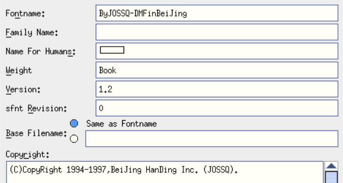
That doesn’t exactly take you closer to the font’s source. A Google search for “Bejing Handing” yields all of 2000 results, none of which have much to do with fonts. “ByJOSSQ” will take you mostly to pre-2010 discussions about Chinese fonts, including the one quoted above. They’re generally siren songs to the tune of “what can I do to make this work?”
As fonts go these days, HDZB_75 covers very few code points: a measly 8307 in total. You can check out the exact coverage in this Excel workbook, where I reproduce the coverage of several fonts in separate sheets.
The font is clearly a simplified one: both in terms of the characters covered and the style of those characters.
Arphic PL UKai
Let’s leave the mysterious HDZB_75 for a moment and take a look at the other obvious free Kai font you are likely to come across. It seems to be a standard part of Ubuntu and other Linux distributions since 2006 or so, and is available here (plus many other places).
That particular page is very economical when it comes to dispensing information about the origins of this open-source font, but it quickly turns out it is derived from a font created and released publicly by Arphic Technology (文鼎科技) in 2001. Some more digging will take you to this fascinating change log by the Linux folks working on the font between 2003 and 2008. After 2008 – silence. I haven’t been able to find any trace of further work on AR PL UKai.
When it comes to coverage, this font includes an impressive 24133 code points – and that’s truly impressive for at least two reasons. First, we’re talking about 2008. It took another 6 years before another free font surpassed this number: it is Noto, created in a joint effort by Adobe and Google. Second, those 24133 code points include 5403 that are above 65535, or beyond the double-byte range. None of the other fonts that I have been able to check on Windows, with the exception of Noto, can say the same.
For quite a while I was convinced the Arphic font was a traditional one in terms of style (it is universal in terms of coverage). I let myself believe this without seriously checking it because of three things. One was a pure assumption: Arphic is a Taiwanese company, so I simply thought the font would follow the traditional style. The second was a single glyph with a split grass radical:

The third thing is that the file is a font collection, TTC, with separate TTFs inside for CN, TW and HK. I naïvely thought that each of these embedded typefaces would hold what it says on the box – but that turns out to have been yet another false assumption.
Arphic Kai – traditional or simplified?
A look at a few of the characters that are rendered differently in traditional fonts reveals that Arphic Kai’s DNA is rather on the simplified side. Below are a couple of such characters, the top row showing them in DFKai-SB, a traditional font of Microsoft pedigree, and the bottom row in Arphic.
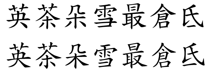
Apart from the split grass radical in 英, which is the one character I infelicitously ended up focusing on, the majority of the others in the image exhibit features that are characteristic of simplified typefaces. But not all of them. I officially forgive myself for being confused.
The punchline is near the top of the change log I linked to earlier:
0.2.20080216: Compile font as TrueType Collection (TTC):
Contains 4 font flavors (CN, HK, TW, TW MBE) which map to different glyph styles. Currently this is only a proof of concept with only 2 codepoints (U+4EE4 and U+9AA8) between CN, HK and TW flavors and 13 different glyphs between the TW and TW MBE flavors. All other glyphs are exactly the same in all flavors.
This is from 2008. After that, the changes stop.
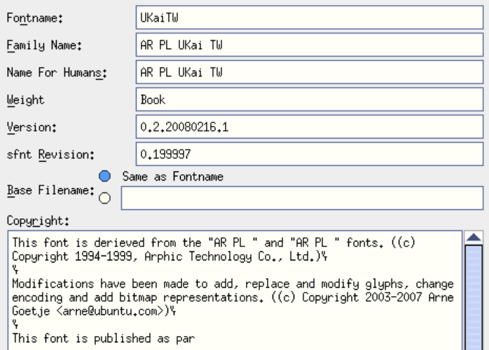
For the sake of completeness, here’s the font information about AR PL UKai TW from FontForge:
Cross-pollination
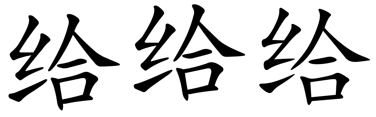
Before I lost my confidence about the Arphic font’s simplified/traditional nature, I was quite self-confident that I would just use HDZB_75 to print simplified characters, and use Arphic for traditional and as a fallback for code points not covered by HDZB_75. To achieve that, I had to manually “calibrate” the way Zydeo prints characters with the two fonts because the glyphs are at a very different vertical position within the reported display rectangle. OK, that sounds a bit complicated, but take a look at the image below; that should make it clear:
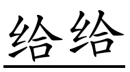
The first character is printed in HDZB_75, the second in Arphic Kai. If you mix the two, you need to manually offset each character to make them align.
But hey… Wait a second! Don’t these two characters look really, really similar? Let’s take an even closer look at them, and let’s throw in the same character from a different simplified Kai font, KaiTi:
I’ll be damned if the first two images are not precisely, exactly identical, apart from the slightly different vertical offset. Regular script characters might look similar from the distance, but if you look at the third one, there are countless subtle differences in the length and shape of each stroke, the bumps at their end, the overhang where two orthogonal strokes meet and the like. But not between the two shapes on the left.
Admittedly, there are glyphs that are eerily similar (or identical) between HDZB_75 and Arphic Kai, and there are others with clear differences. But the level of overlap is striking even upon casual observation.
The original Arphic copyright is 1994 through 1999; the copyright of the derived public font is 2003 through 2007. The Beijing Handing copyright is 1994 through 1997. Somewhere in between these dates and eerily similar shapes is a story that will probably forever remain unclear. Both fonts have been out there for free for over ten years now; it’s probably best to keep that mystery as it is.